Have you ever been out late at night and fancied popping into a favourite restaurant for a meal, but you’re not sure what time they close? You reach for your phone, find their website … and by the time you’ve managed to track down the opening hours you’re too late, they’re shut. Frustrating, huh? What that restaurant needs is a mobile-friendly website!
Some statistics for you about mobile phone use in the UK:
28% of internet browsing is done on a mobile phone – and the number of people searching the web via smartphones doubles every two months
50% of Google searches on mobile phones are looking for local businesses – restaurants, shops, locksmiths, grocers, bars, pubs …
86% of all adults own at least one mobile phone
Yet most websites aren’t optimised for mobile phones.
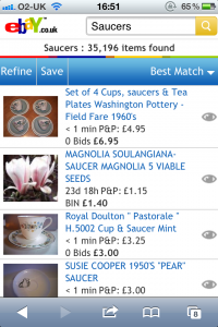
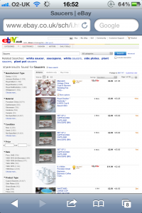
What do I mean by that? Well most websites are designed to be used on a large screen. They probably work perfectly on a monitor – but when you try to use them on your mobile phone you run into problems. The phone may display only a part of the website or it might cleverly resize the whole site, reducing it to such a small size that it’s impossible to read. To click links or buttons you have to zoom in and scroll around to find the information you need. And all this takes time and uses up your phone’s data allowance too! But what’s the answer? Mobile-friendly websites, that’s what. Mobile websites are designed specifically for use on mobile phones so they are simple to navigate and easy to use. You don’t have to scroll around to find the information you want, or get a magnifying glass out – it’s all there, it’s easy to read and better still it’s easy to access. To show you what I mean have a look at these two images. The one on the left is eBay’s normal “desktop” website as viewed on an iPhone. The image on the right is eBay’s mobile website, again viewed on an iPhone.


Which one would you prefer to use?
I’ve just launched a brand new product – mobile-friendly websites that complement your main site. The sites are simple yet stylish and incorporate your company logo and brand colours. You can also have up to 10 pages that give people the kind of information they want at their fingertips when they’re out and about – information like prices, menus, opening hours, directions – plus a big fat CALL NOW button so people can get in contact with you quickly and easily.
The mobile-friendly websites will be £197 for 6 pages (£99 for 3 pages and £297 for 10 pages) but for the first ten orders only I’m offering a special price of just £99 for a six page mobile website … If you’d like to reserve your mobile-friendly website at the special offer price email me now!
You can see a sample of a mobile-friendly website and find out more here. Alternatively point your smartphone at the QR code below, or take a browser’s eye view of a mobile website by visiting m.theprooffairy.com


Thank you for making this website so easy to find info. wonderful stuff. Saving this one for later.